SynthesisTurning a six-billion-dollar dashboard into a decision workspace
A reframe of how NielsenIQ category managers worked with sales-intelligence data, run as a workshop with serious prework and a concept that reads at a glance. It also looks at how I would run the same engagement today with AI inside the loop.
Client NielsenIQ (Nielsen)Role VP, User ExperienceCodename SynthesisPeriod 2019 – 2021
Final direction: Synthesis moved the product from dense reporting to a decision workspace, with high-level signal first and drill-down only when a manager needed it.
The Problem
Half of NielsenIQ's revenue came from CPG sales-intelligence data. The reporting put everything on screen at once. Category and field managers gritted their teeth and used it because the data was indispensable, but the interface didn't match how they actually decided.
The Approach
Run a cross-functional workshop, but treat prework as the work — interviews, workflows, journeys, competitive context — so kickoff felt like refinement, not a cold start. Cross-pollinate teams. Push past polished but conservative ideas. Land a concept the team could defend and ship.
The Outcome
A decision workspace built around heat-mapped categories, drill-in performance, and density that scaled from a few hundred variables to nearly a thousand without losing scannability. Three-screen concept handed to engineering for build and to leadership for go-to-market.
Before / After
The redesign was not about making charts prettier
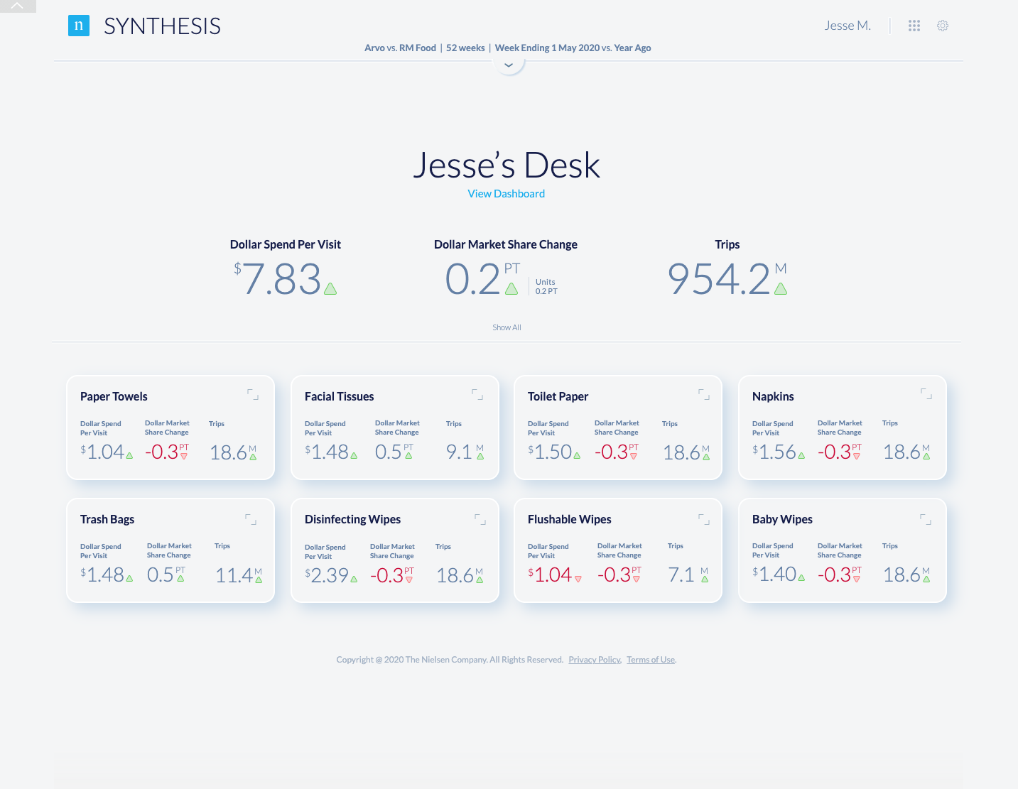
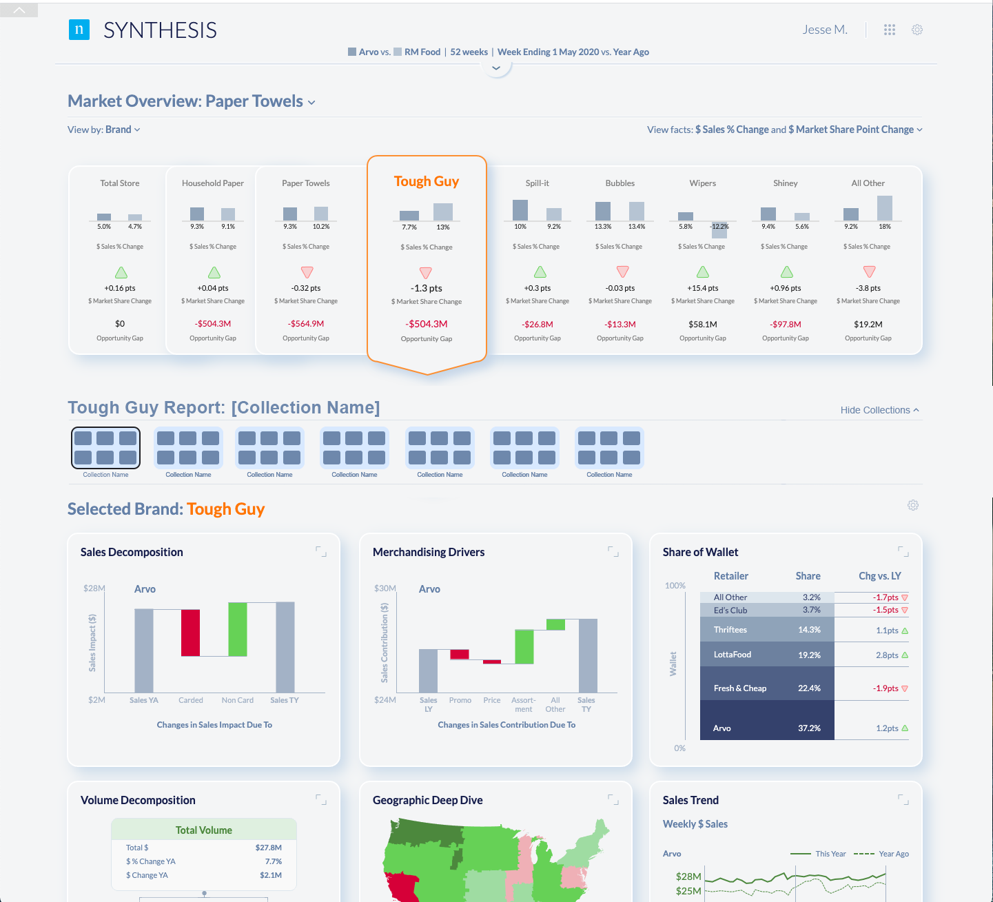
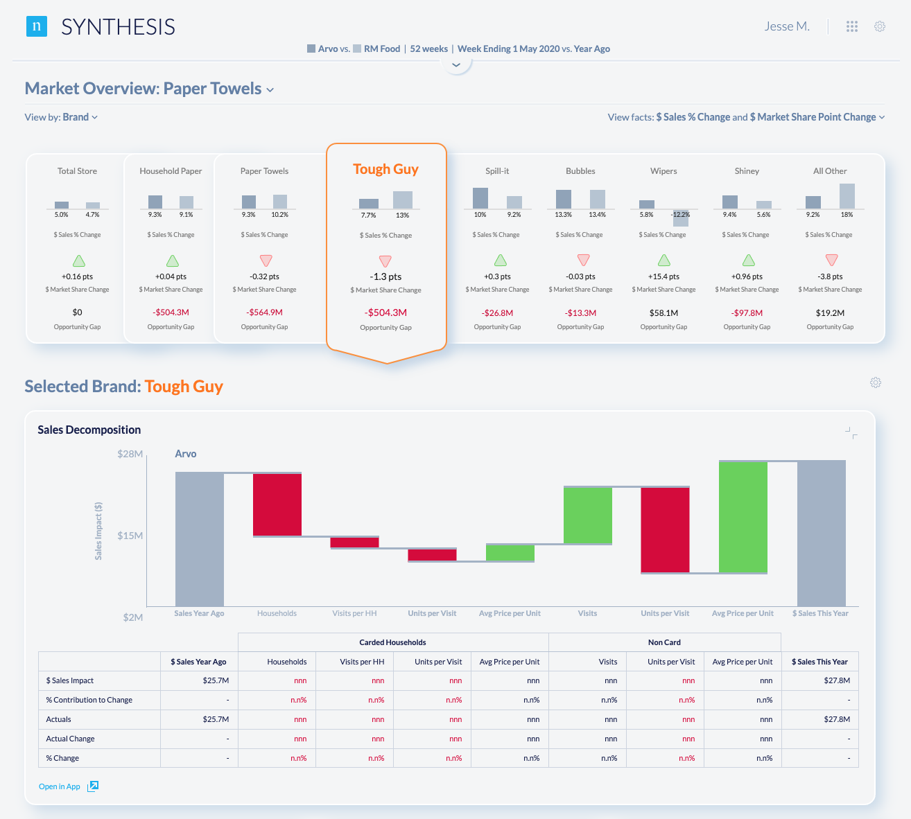
The original interface showed the data, but it did not make the decision obvious. The Synthesis direction gave category managers a place to start, a way to scan, and a clear path into the detail.
Before: everything at once. Useful data, weak hierarchy.After: overview, category signals, then drill-in.
Inside the workshop
Pre-work is the work
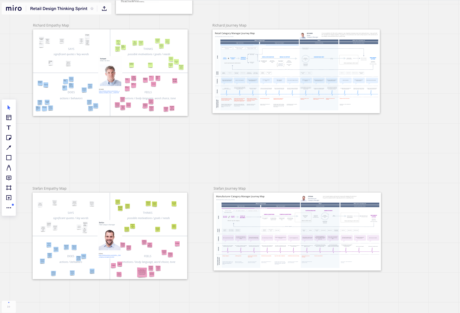
Walking into a kickoff with empty walls and warm coffee is a wasted week. The pre-work — expert interviews, field conversations with category managers, journey and empathy maps for specific decision moments — sets the standard before anyone sits down. The kickoff should feel like revision, not introduction.
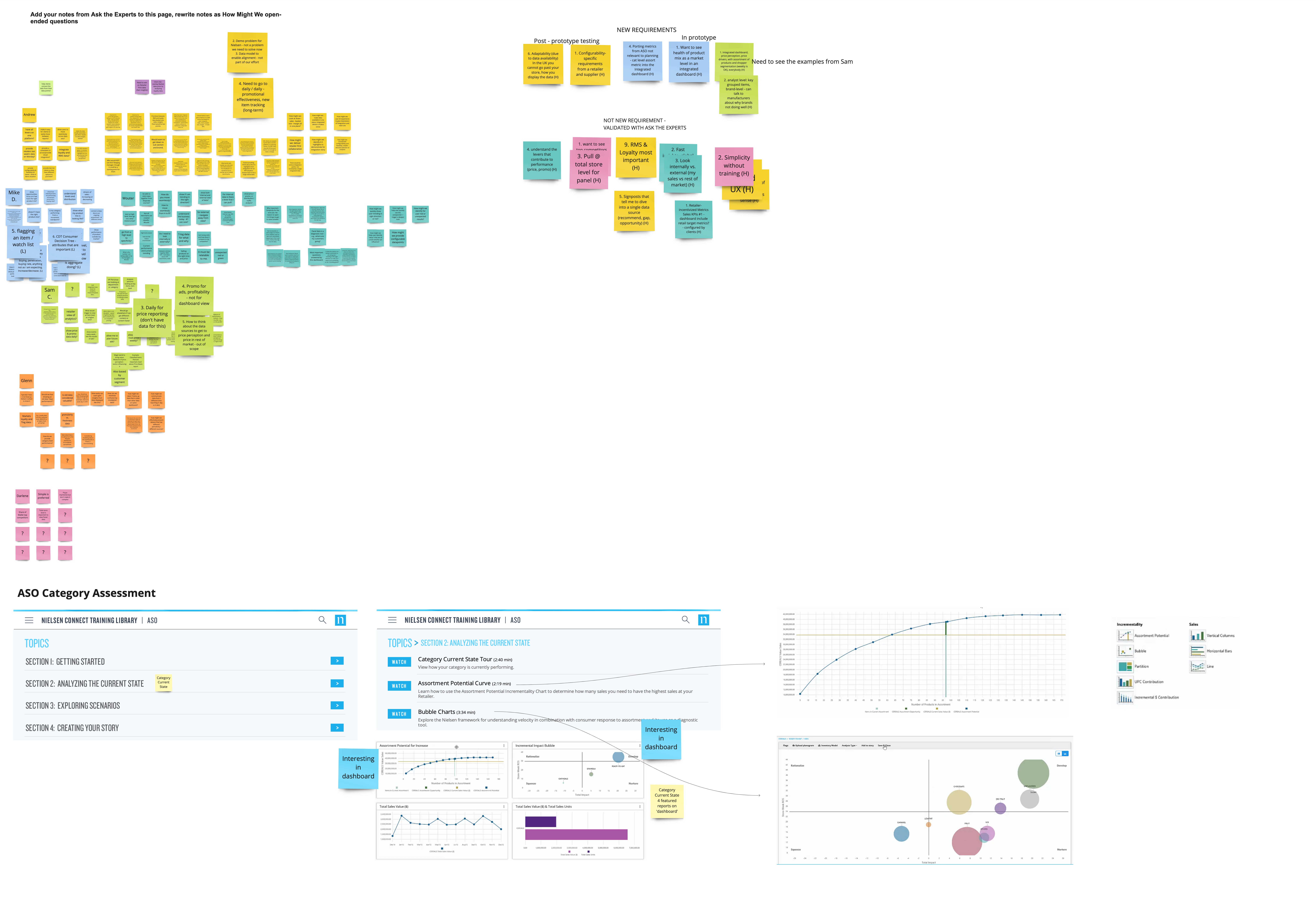
Personas and journey maps: decision moments were mapped before any interface decisions were made.Synthesis board: turning raw workshop input into prioritized questions.
Teams that show up with opinions, then change their minds
Cross-functional teams arrive with takes shaped by the prework — so the conversation starts with substance. The trick is then cross-pollinating: rotating people, forcing teams to build on each other's ideas instead of defending their own.
Team structure: cross-functional groups came in prepared, then rotated ideas across teams so ownership did not trap the solution.
Concepting: get past the polished safe answer
Three things go wrong in concepting if you let them. Teams iterate conservatively when there isn't time. The most polished sketch wins because it's the most polished, not because it's the best. And once you generate a lot of ideas, most of them quietly disappear.
Exploration: multiple directions surfaced, but the heat-map pattern best matched how category managers scan for risk and opportunity.
The shape of the answer
The first round of designs were polished versions of the chaos we'd inherited — that's normal. We went back, sketched, questioned the data viz, and asked what category managers actually do all day. They aren't in love with a 48-ounce bag of frozen peas. They want to know, at a glance, where the business is bleeding and where it's working.
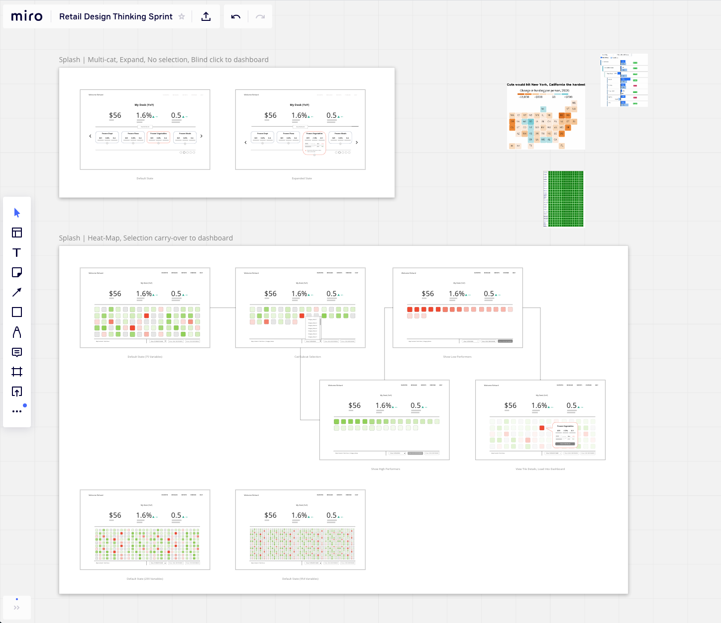
That landed us on heat maps: green for healthy categories, red for the ones that need attention; filterable by performance; drill-in to interrogate any one cell. Density mattered. We tested layouts at 290 variables and again at 954 — both still scannable. The system held.
The final direction, which we called Synthesis, was a card-and-dashboard pattern: choose a card to open the dashboard for that book of business, then drill into charts beneath it for depth. Three screens, handed off for engineering build and for leadership to use as the go-to-market story.
Overview: business health by category.Dashboard: category scan plus selected brand context.Drill-in: explain the movement without losing orientation.
Testing
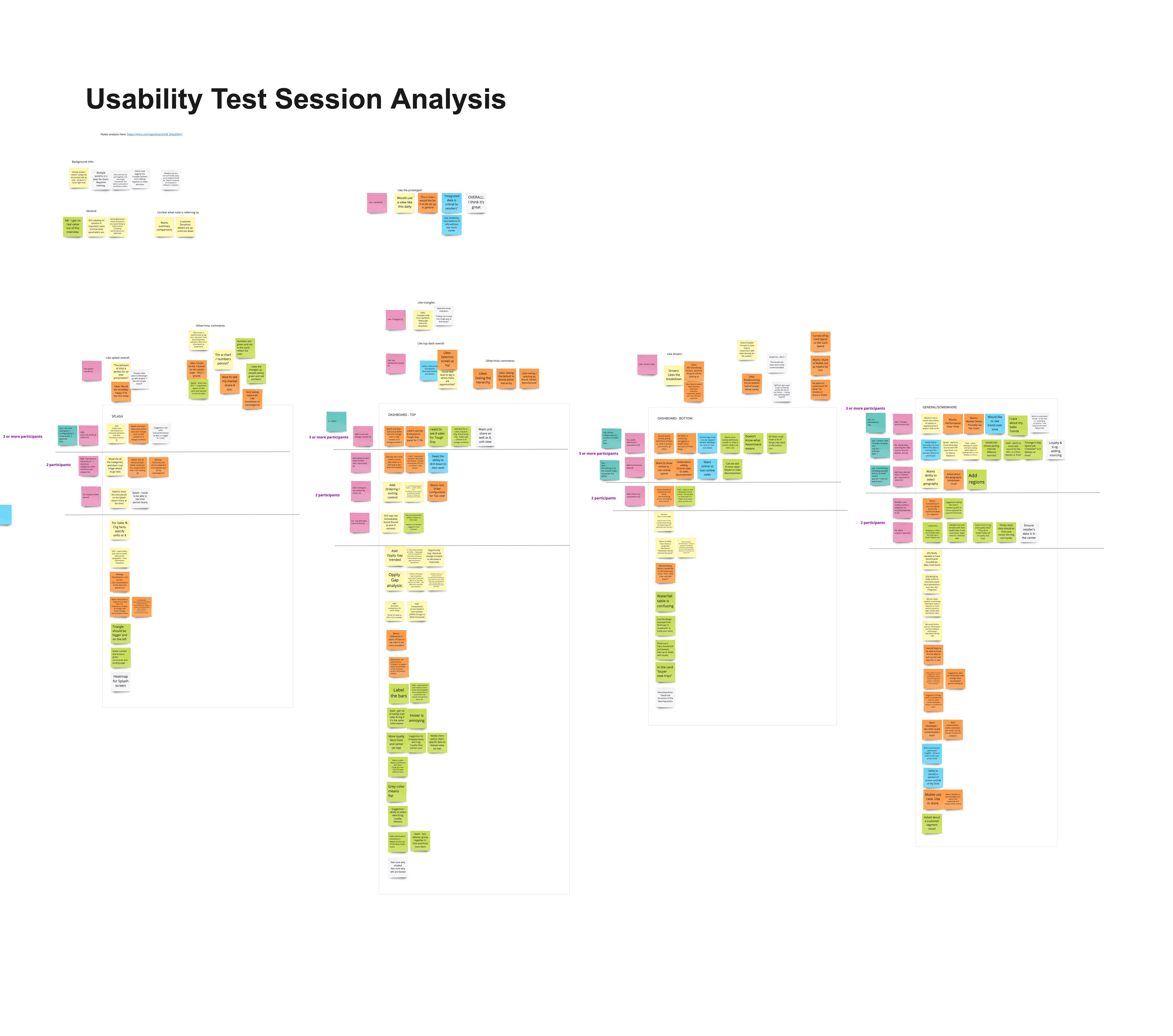
The concept tested well, but the sample was limited and the friction we saw was on click states and interactive behavior—exactly the kind of feedback static screens could surface but not fully resolve.
Validation: the concept tested well, with friction centered on interaction details that would be better tested in a functional prototype today.
Personas & journey maps shaped before kickoffHeat-map decision surface for category managersDensity tested 290 → 954 variablesThree-screen concept handed to engineering & GTM
If I ran this workshop today
AI would compress the work around the room, not replace the room
The original workshop produced a strong direction. AI would not change the need for expert interviews, cross-functional judgment, or direct contact with category managers. It would shorten the distance between those inputs and something the team could evaluate together.
Prepare
Catalog and synthesize interviews, journeys, constraints, and competitive context in one briefable workspace.
Give every team the same grounded starting point before kickoff.
Explore
Make rough ideas tangible during the session so polish does not decide which direction survives.
Surface cross-team patterns while the people who generated them are still in the room.
Test
Move the strongest direction into a working prototype, then adjust and retest interaction details quickly.
Use transcript synthesis to compare themes across sessions without outsourcing the judgment.