The situation
Arity is Allstate’s data-driven telematics business, with the world’s largest repository of connected driving data. Its primary product was an SDK that partners such as Life360 and Experian integrated into mobile apps and workflows they already owned. The challenge was simple and daunting: show how driving data could strengthen those relationships through experiences around driver safety, driver coaching, and crash detection. The promise made sense, but partners still struggled to picture what it looked like inside their product.
I built an AI-driven prototyping workflow for industry-specific solutions that made Arity’s value tangible in the room — and three SDK partnerships closed.
The architecture I was designing into
Three audiences, one screen.
Across Arity’s four business units, three audiences kept showing up — and the design had to serve all three on the same screen.
Arity (the platform owner)
Needs the data integrity preserved, the source attributed, and the platform’s standards visible enough that the next partner can trust them. Internal stakeholders: product, sales, data science.
The partner (the mid-tier business)
For Mobile Publishing, this is Experian, Alarm.com/ADT, SiriusXM — each of them embedding Arity inside their own product, under their own brand. They need the integration to read as theirs, not ours. For Aggregated Insights, this is a team working from zip-level driving data — pricing, planning, or policy. For InSol, it’s an insurance underwriter.
The end customer (the consumer or operator)
The driver inside an Experian app. The homeowner inside an Alarm.com dashboard. The municipality resident affected by a traffic decision. Most often these people never know Arity exists, and that’s correct — the brand promise belongs to whoever sits in front of them.
Support the business and the customer with the same decision. Both, or it isn’t done.
RTA
A complex model, told one story at a time.
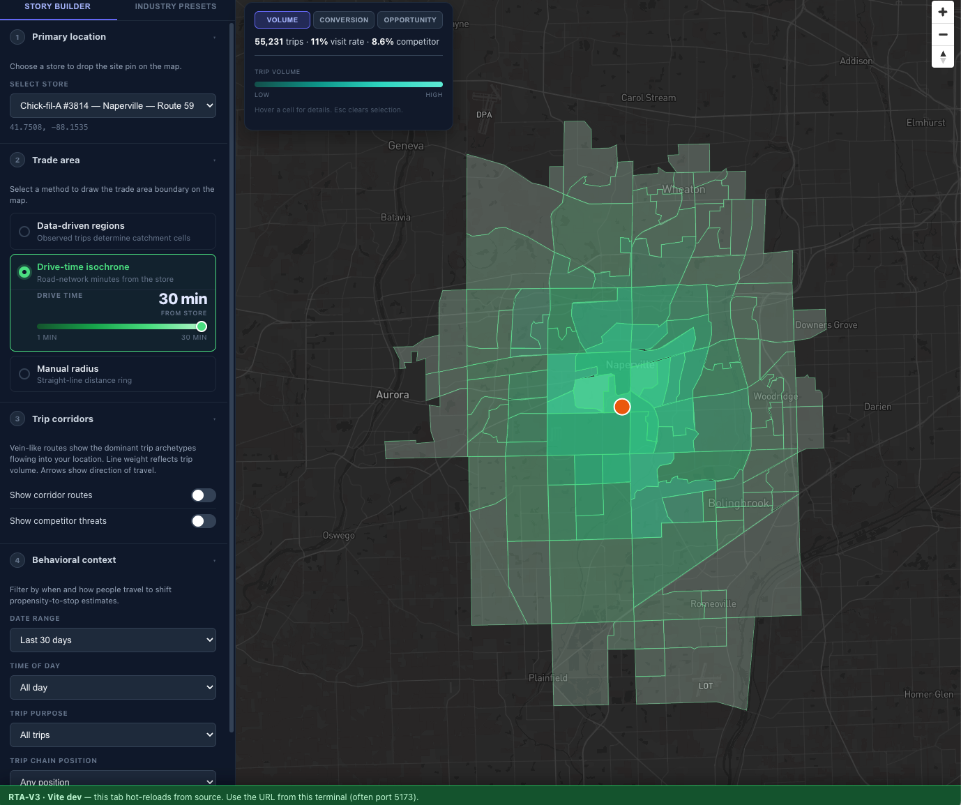
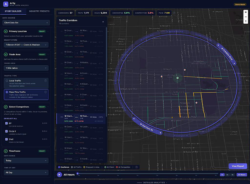
The RTA demo builds a data model step by step — geography, timeframe, competitive context, traffic type — each parameter narrowing what counts as the trade area. The Story Builder walks a partner through that stack in a left rail: numbered steps, each marked READY when complete, the map updating as the assumptions land. The complexity lives in the model; the interface turns it into a story.
Once the trade area is set, partners examine driving behavior in micro detail: who passes the store, who stops, which corridors carry the volume. They can compare competitor drive-in conversion against their own site, then weigh Arity’s telemetry against a traditional mileage-radius trade area and against third-party trade-area vendors they already use. That comparison is where the data advantage becomes visible.
The design decision was the order of operations. Locked progression keeps each assumption visible as the model builds — the narrative carries the complexity so the partner does not have to absorb it all at once.
Geosight
Geosight automates the management of zip-based driving data.
Geosight runs on Aggregated Insights: anonymized driving data, rolled up to the zip level. Year to year, most zip profiles barely move. That stability is exactly why drift matters. When a safety score or phone-use rate shifts enough to cross a threshold, someone needs to see it — not after the next refresh cycle, but when the change happens. Geosight is built for that.
Two views, two questions — same product, not two audiences. Single-area view: pick a zip or territory and read its driving performance straight (safety, driver score, hard braking, whatever metric is in scope). Regional heatmap: scan a whole region with threshold filters and see what breaks rank — the top five and bottom five zips on any variable in the stack.
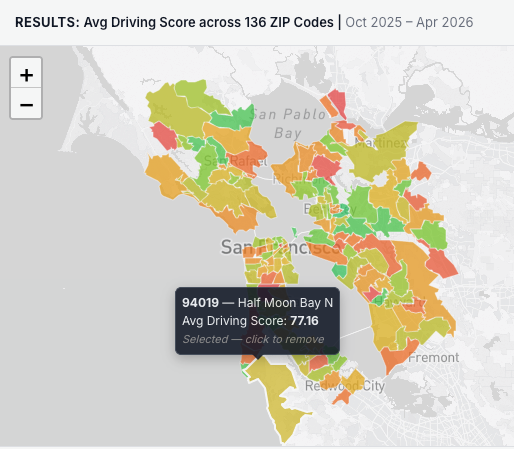
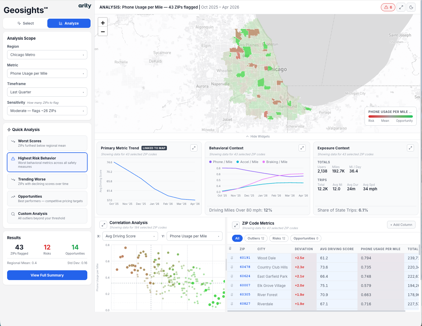
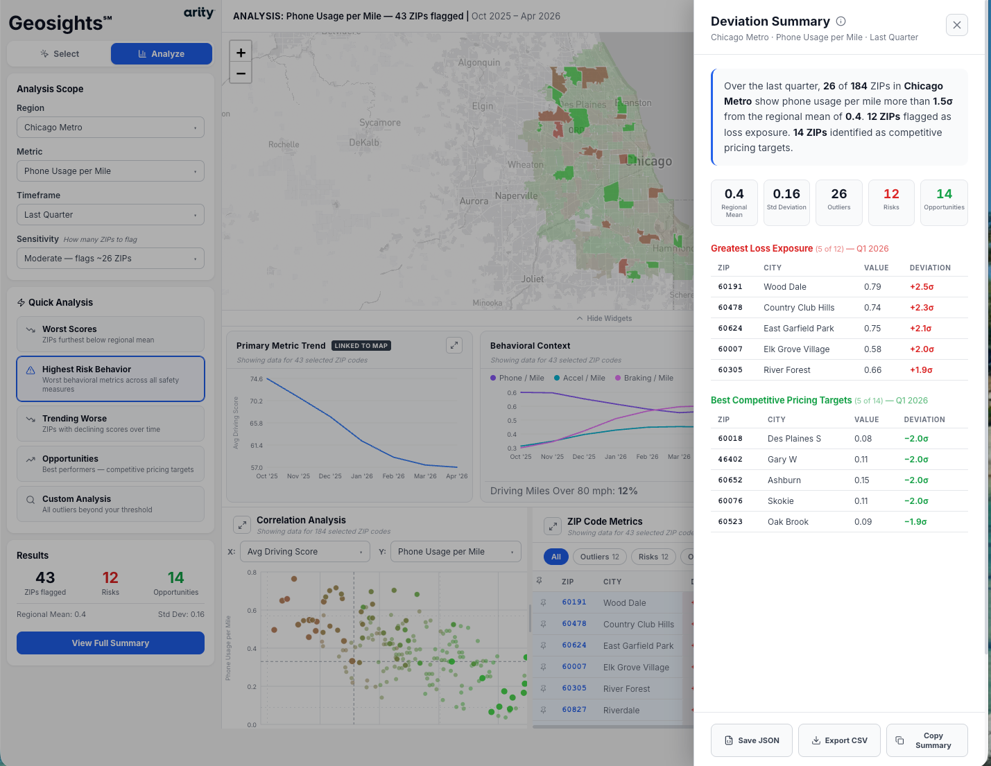
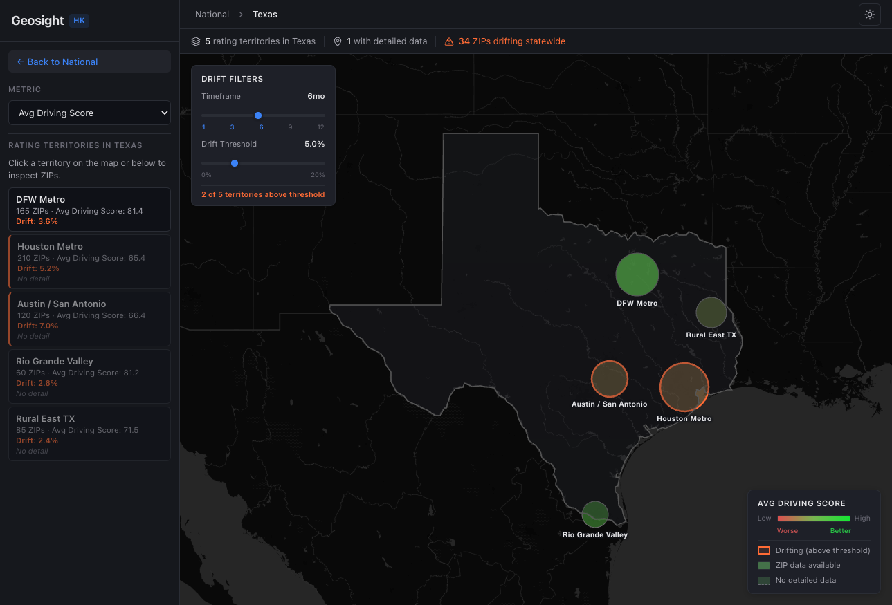
The design decision was to lead with drift, not snapshot. Static choropleths are easy to ship; they go stale the moment they’re printed. Timeframe comparison and threshold filters sit in both views so what you see first is movement. Single-area reading and regional outlier scanning are different tasks; drift is what ties them together.
Mobile Publishing
When the design has to disappear into someone else’s brand.
The Mobile Publishing business closed three SDK partnerships during my tenure: Experian (driver-score features inside a credit and identity product), Alarm.com / ADT (vehicle and driving signals inside a connected-home dashboard), and SiriusXM (connected-vehicle features inside an in-car audio experience). Each one is a B2B SDK licensing arrangement. Each one ends up in front of millions of end customers who will never see the Arity name.
I cannot show those partner-cobranded screens here — they belong to the partners, under NDA — but I can show the decision framework I used across all three.
Defend the data, defer on the chrome.
The rule I held: Arity gets to insist on how the data is computed, labeled, and qualified. The partner gets to insist on how the data looks, sounds, and is named inside their product. The boundary lives at the integrity of the calculation, not at the pixel.
Partner brands got theme adapters on a single reference design.
We built a single reference implementation of each SDK feature in an Arity-branded sandbox, then produced a theme adapter for each partner that bound the same component tree to their type, color, spacing, and copy systems. The partner’s product engineering teams could read the diff, not relearn the system.
The hard part isn’t the SDK integration. It’s holding the line on data integrity while the partner owns everything the customer sees. That trade is most of the job.