The situation
What we were solving Microsoft Connect is Microsoft’s internal partner portal — the platform channel and sales teams use to create programs and configure partner sites. A decade of bolt-on features had fractured the experience. We led a design system refresh for Microsoft from primitive tokens through global page templates, so three visual directions could ship on one shared architecture instead of three separate redesigns.
Design system strategy
Fix the foundation first. Then argue about the paint color.
A design system is a shared set of rules for how a product looks and works — colors, typography, buttons, forms, alerts, page layouts — documented clearly enough that design and engineering build the same thing every time. For MS Connect, that was the strategy: stop redesigning screens one at a time, and define the layers below the screens first.
We worked bottom-up in four layers. Get the primitives and components right, and the Create New Program flow — plus the page builder admins use to configure partner sites — could be skinned three different ways without re-architecting the product each time. Stakeholders could compare visual directions on equal footing. Engineering would inherit specs, not one-off comps.
The stack we used — same structure in every direction:
Primitives
Raw Ingredients
- Color tokens
- Type scale
- Icon grid
- Spacing rhythm
Semantics
UI Elements
- P1 & P2 actions
- Active states
- Alert levels
- Functional vs marketing copy
Components
Building Blocks
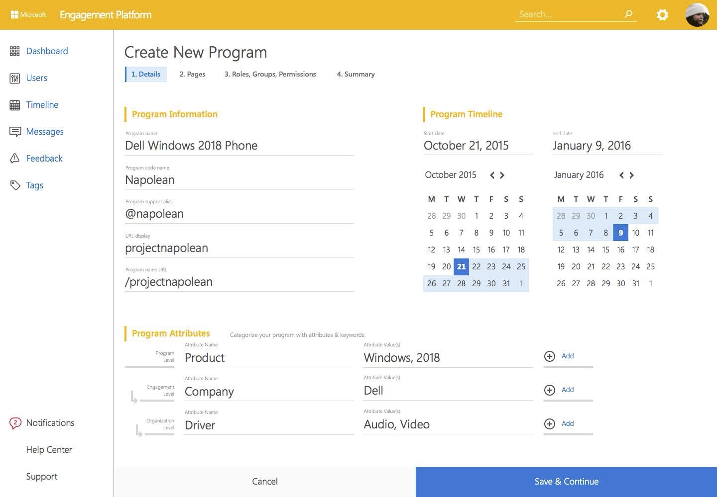
- Inputs & date pickers
- Tabs & steppers
- Panels & notifications
- Nav & overlays
Templates
Page Assembly
- Program Flow
- Page builder blocks
- Drag-and-drop regions
- Role & permissions steps
Three visual directions
Tokens and components, spec’d before stakeholders picked a skin.
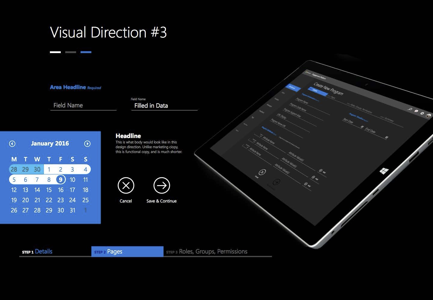
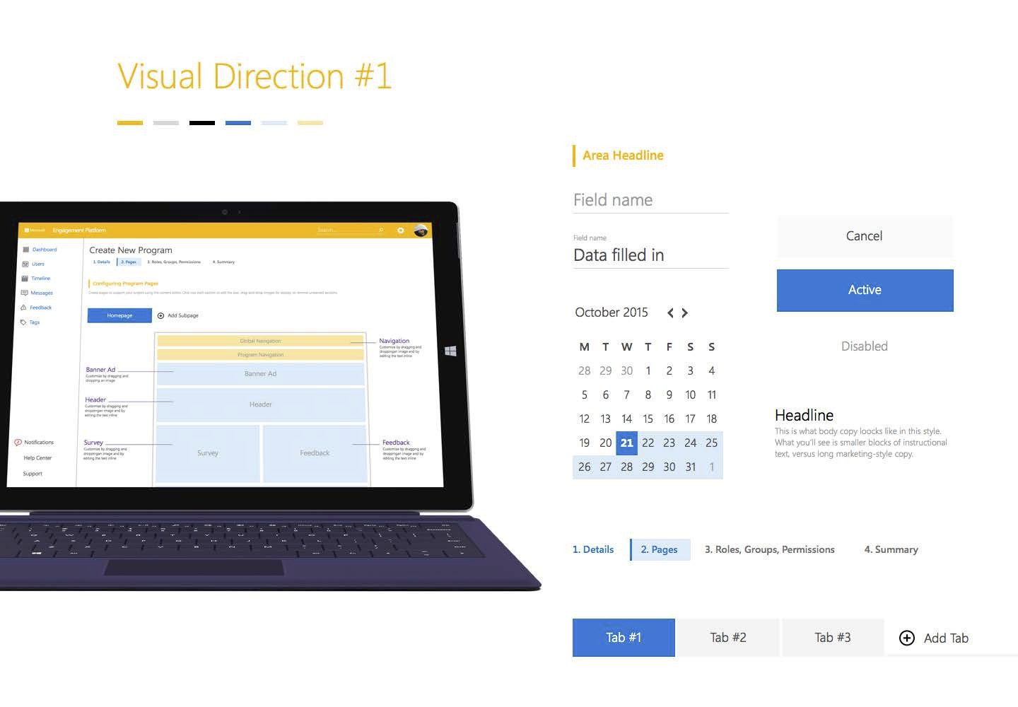
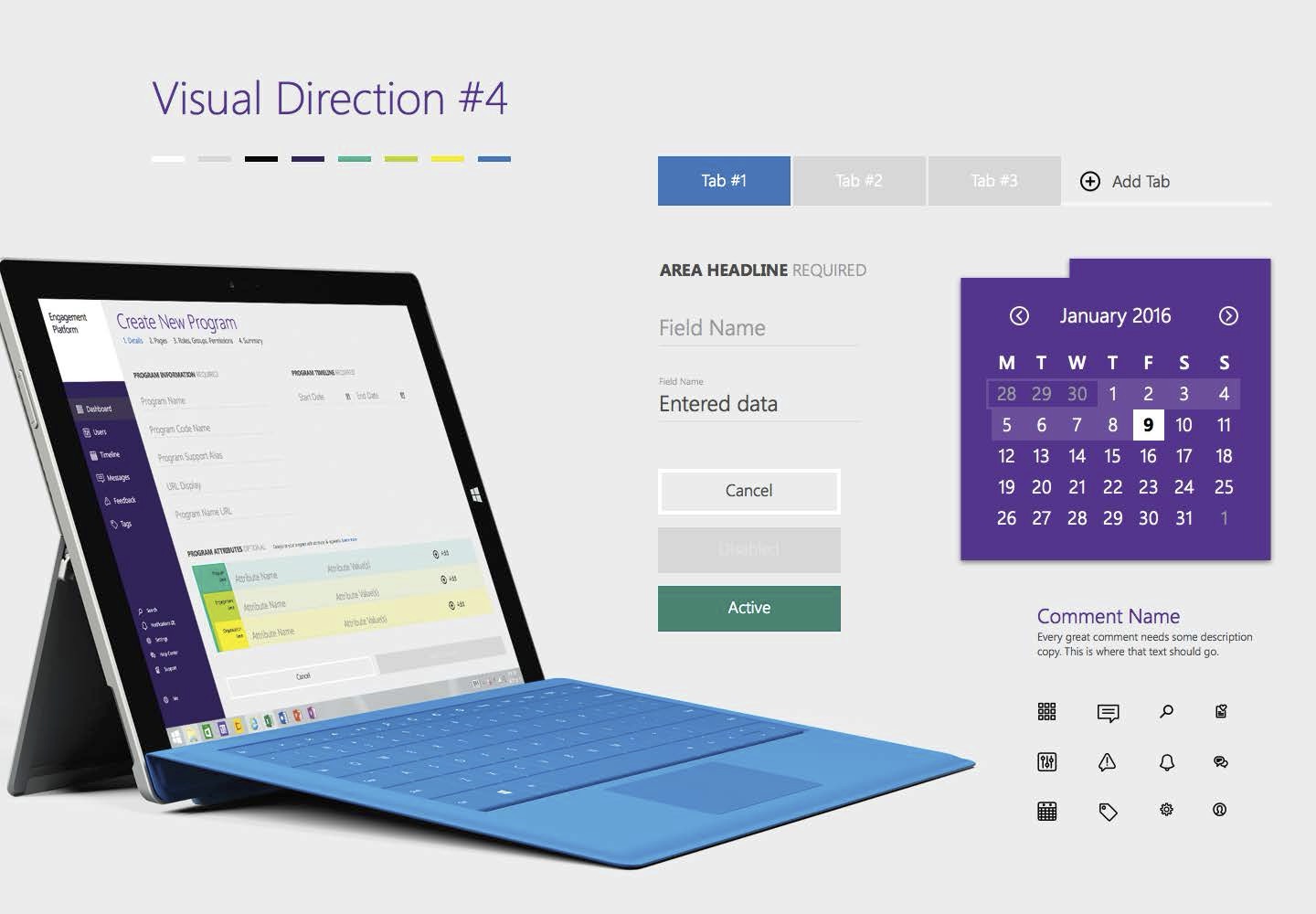
Each direction shipped as a board: palette, component anatomy, and a device mockup on the same Create New Program workflow.
Three skins, shared flow
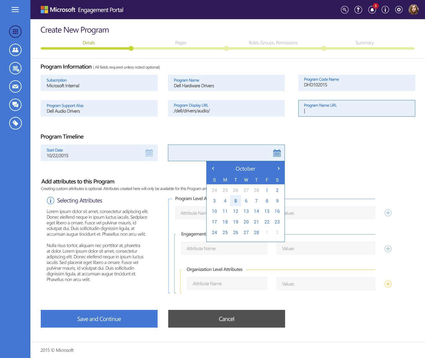
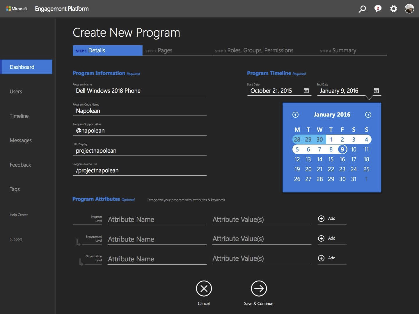
Program details — unchanged IA, different token sets.
Direction 1 · Light
Direction 4 · Purple
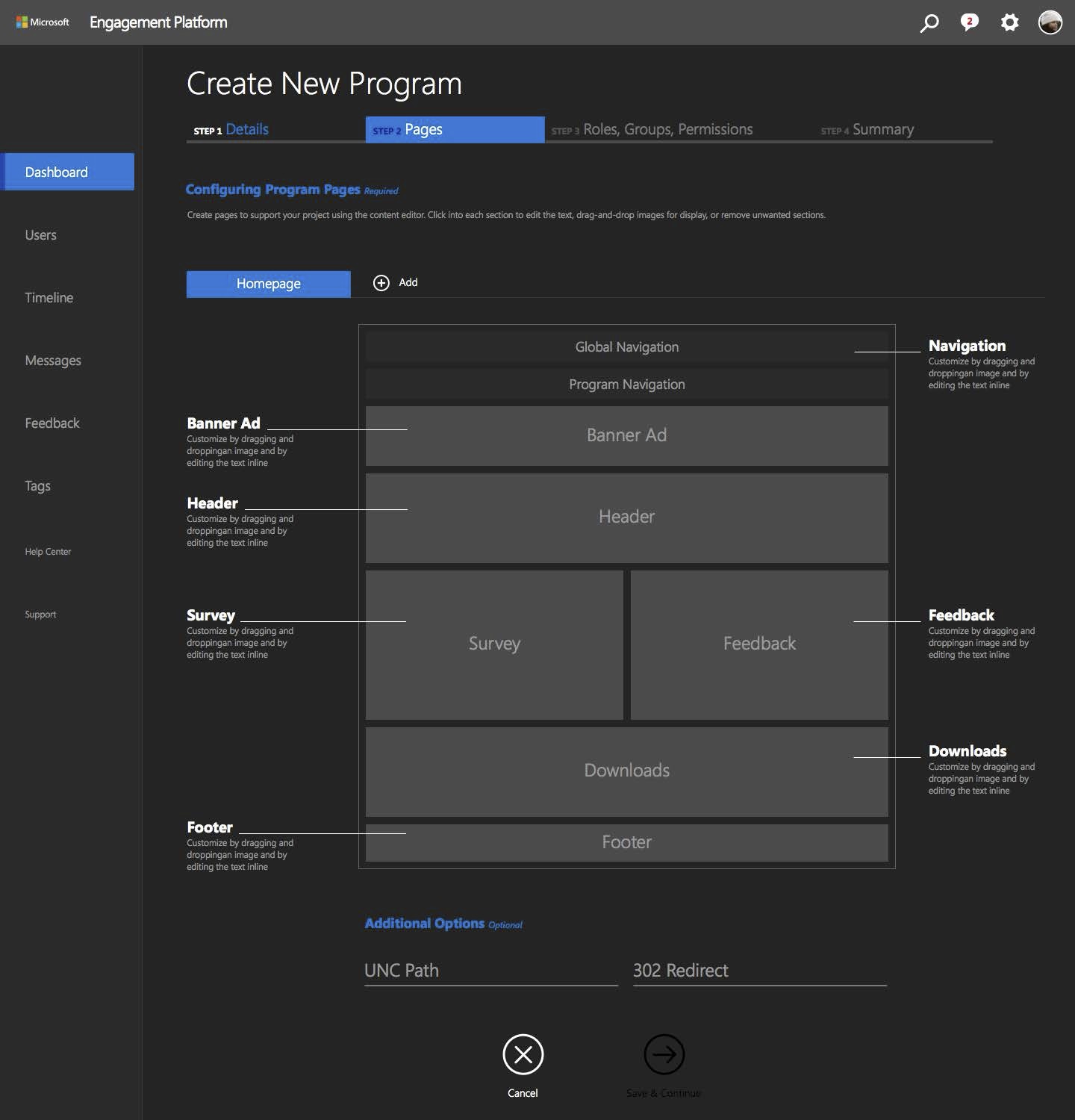
Direction 3 · Dark
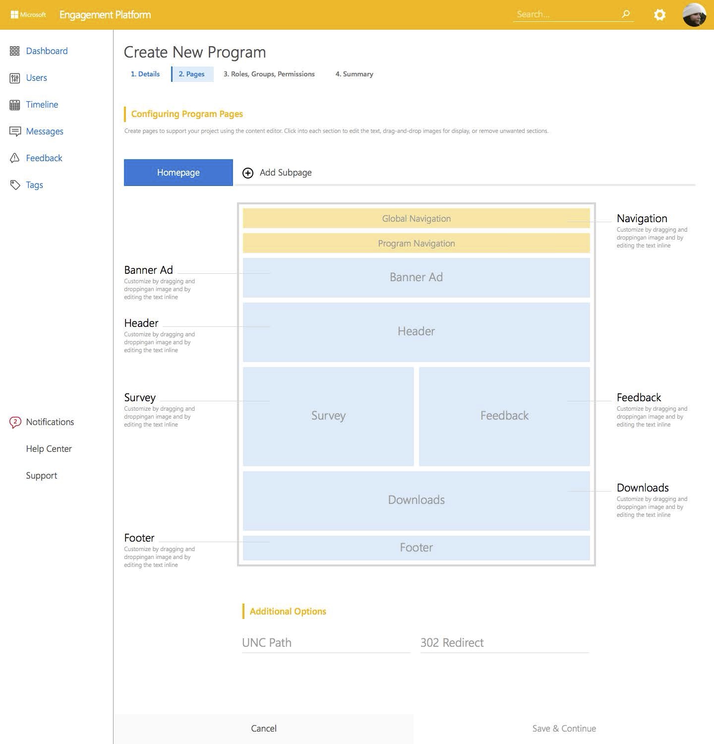
Page templates
Composable blocks, not one-off layouts.
The Pages screen exposed the template layer: Global Nav, Banner, Survey, Feedback, Downloads — drag-and-drop regions with inline editing.
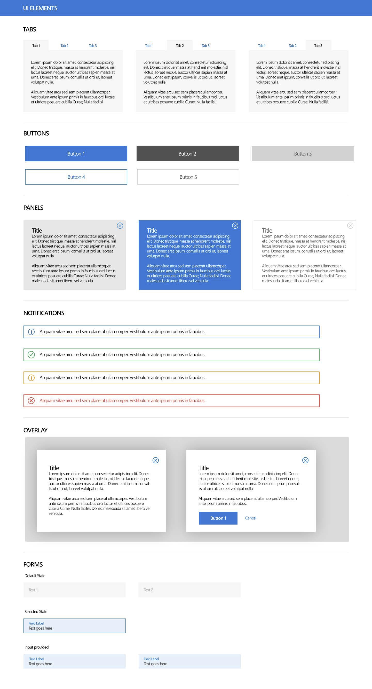
Component specifications
UI Elements — tabs, buttons, panels, notifications, forms.
Direction 4 included a full component sheet: every state a dev or QA would need before build.
Three decisions
Calls that made the system hold.
Foundation before features.
We didn’t wireframe screens first. We defined tokens, states, and components — then applied them to the Create Program flow every direction shared.
Structure independent of skin.
Same four-step stepper, same attribute hierarchy, same page-builder blocks. Stakeholders could compare visual directions without relearning the product.
Templates as governed modules.
Pages weren’t freeform. Banner, Survey, Feedback — predefined regions admins could configure. That kept partner programs on-brand at scale.
The work
Agile sprints, research-first.
As UX/UI lead, I ran a design team across six months of Agile sprints. Early sprints: IDIs with internal stakeholders, quant studies with external partners. Architecture and final designs shipped in a test-and-learn loop — not a big-bang handoff.