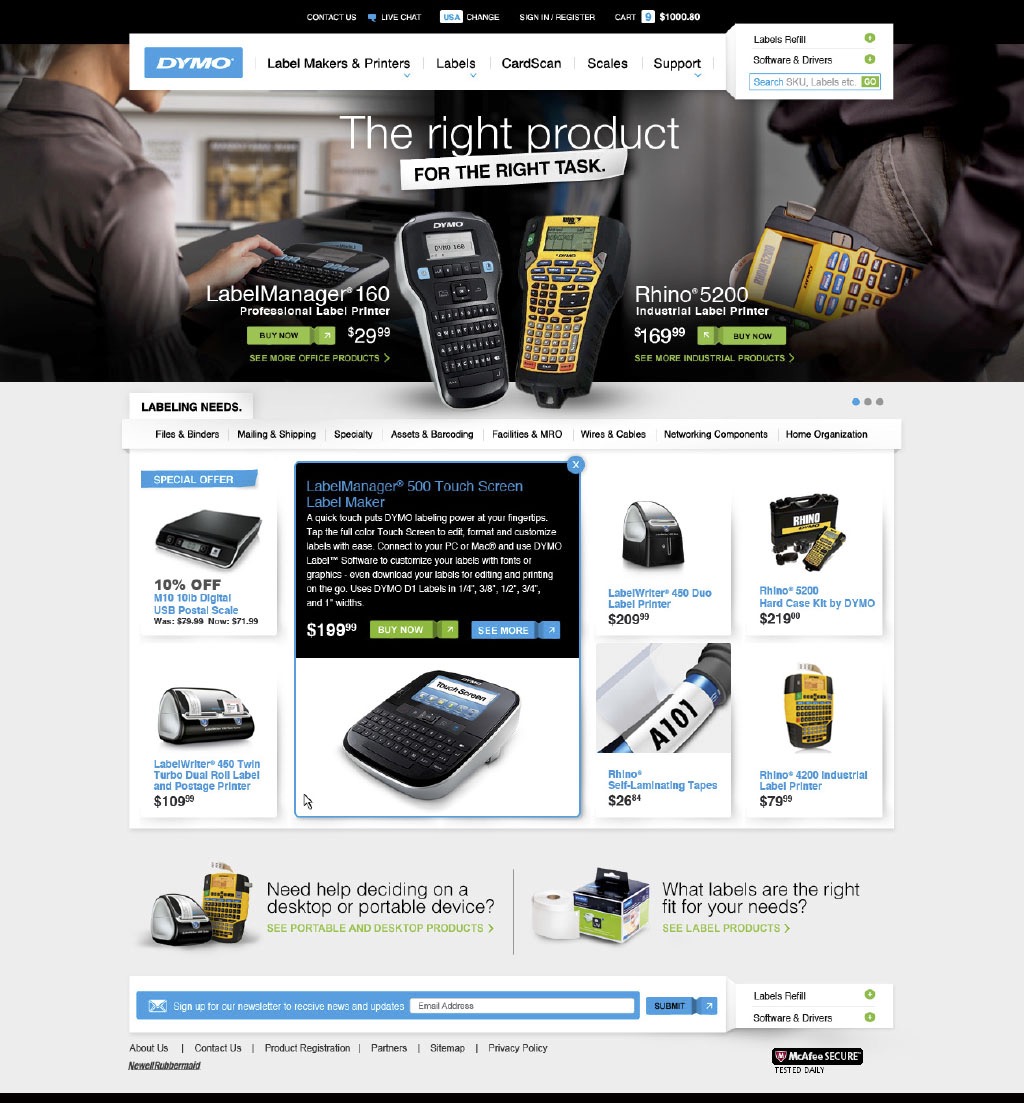
The situation
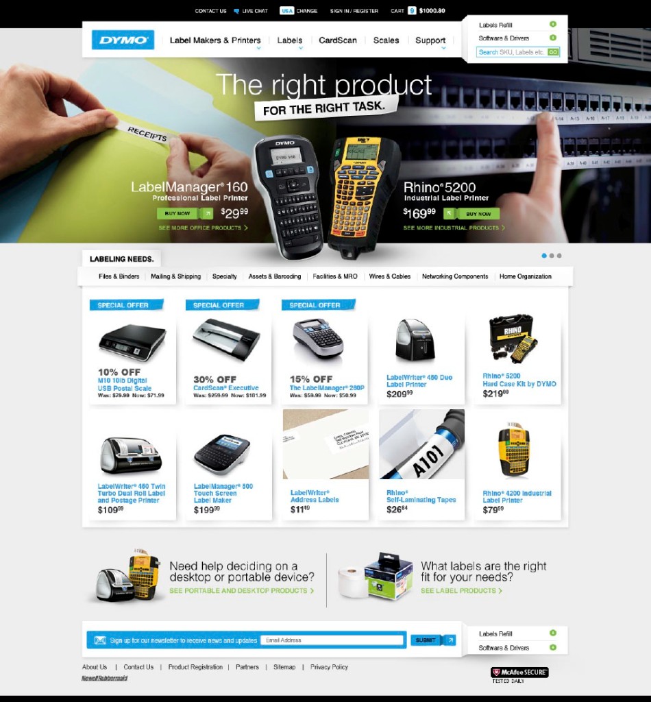
What we were solving DYMO is the labeling brand most people grew up with — embossed tape, handheld printers, the works. By the time Rosetta took on the site, it served two buyers with equal relevance: the office manager labeling file folders and shelves, and the industrial manager labeling server racks and telephone closets. The site had to speak to both without splitting the brand.
Dymo had two disparate markets, we supported both with one site.
The office manager labeling file folders and the industrial buyer spec’ing a Rhino for the data center both had to feel like the site was built for them, without forking the brand into two properties. We used the homepage hero, the navigation, and the product taxonomy to make both paths obvious while keeping one catalog and one checkout.
I led creative direction and client presentations for Newell Rubbermaid, with executive oversight across the design work through delivery.
The deliverable
Office and industrial, same browse and buy path.
The homepage hero splits between office and industrial use cases (“the right product for the right task”), then opens into a tabbed product grid by labeling need: files and binders, mailing and shipping, wires and cables, networking components, home organization. Hardware and consumables live in the same catalog.
Guided-selling modules at the foot of the page (“Need help deciding on a desktop or portable device?”) help both audiences find their way without splitting the experience.
Homepage · in-grid quick view