The situation
What we were solving US Bank is the fifth-largest U.S. commercial bank, with assets over $450 billion. They were Wipro Digital’s flagship client. We worked with the Corporate Payment Systems group to redesign Access Online (AxOL), the application corporate clients use to open and cancel card accounts, run expense analytics, and manage the daily needs of thousands of clients and millions of cards.
Millions of cards. The app hadn’t kept up with how people actually worked.
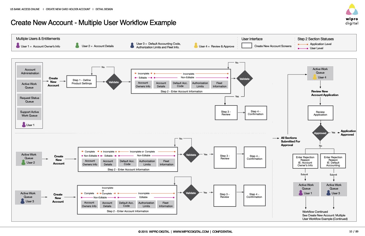
AxOL had to serve three audiences on every screen: the individual cardholder doing day-to-day administration, the manager running reports and approvals, and the executive tracking global KPIs. The existing application hadn’t kept pace with how any of them actually worked. We rebuilt the experience around those roles — not around the org chart that built the old one.
The deliverable
Spec the system, not just the screens.
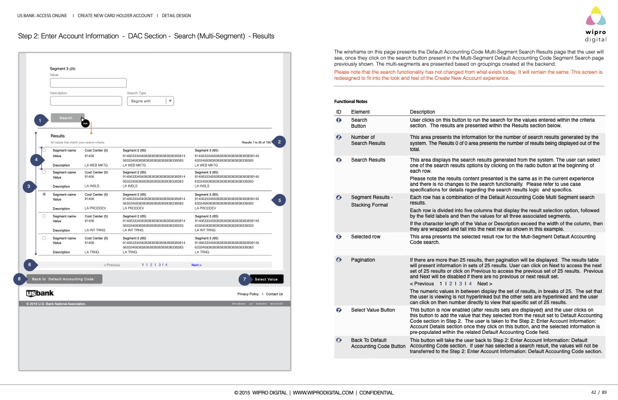
The deliverables went deeper than comps. We mapped full account-creation workflows with decision points and validation gates, documented each screen with functional notes precise enough to build from, and specified components at the token level — type ramps, color values, states, and radii. Same rigor as the Microsoft and IBM work, applied to a B2B fintech product managing corporate card operations at scale.
Workflow · main path
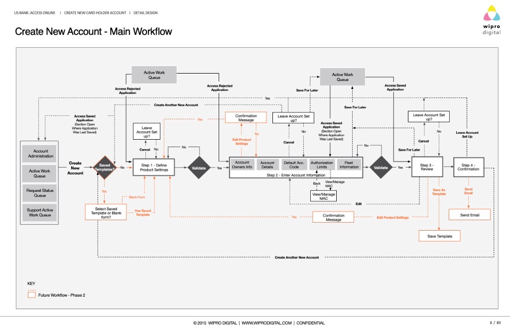
Annotated wireframes
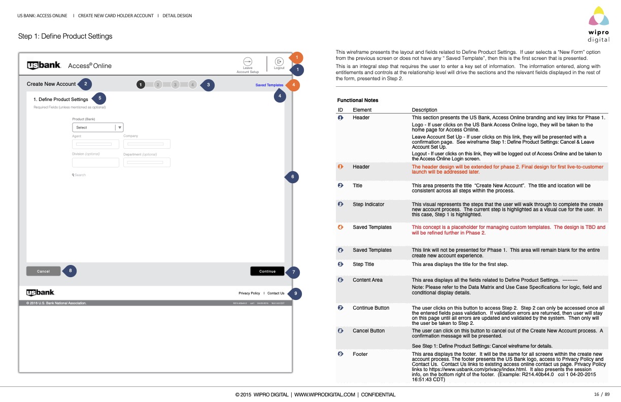
Each screen, with functional notes.
Every screen shipped with numbered callouts and a functional-notes panel: what each element does, how validation behaves, what carries into the next step. Engineering and QA could build without a second interpretation pass.
Step 1 · Define Product Settings
Design system
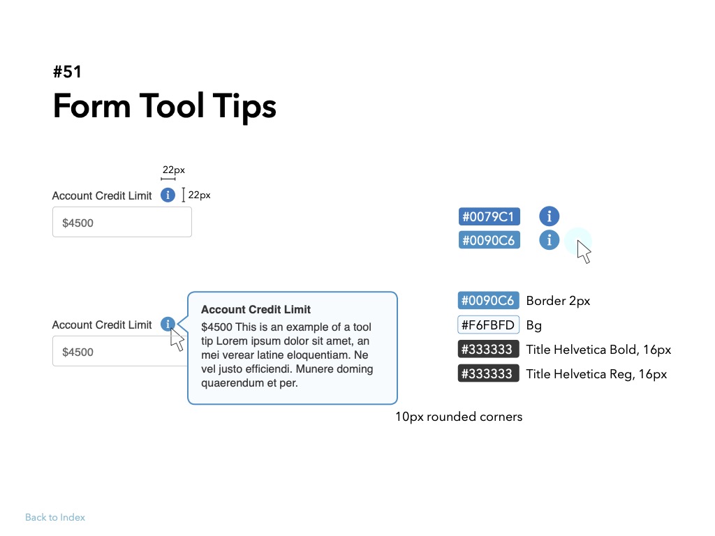
Tokens, type, and states.
Components were specified at the level a developer needs: exact color values, the Helvetica type ramp, selected and unselected states, border weights, corner radii, and logo clear-space. Screens inherited from these primitives instead of being drawn one at a time.
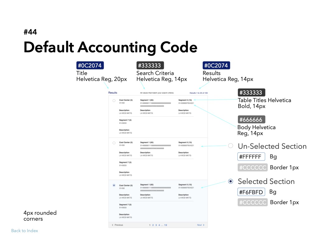
Component · #44 Default Accounting Code
One decision
Tokens and states before page layouts.
Define the component library first. Screens inherit from it.
AxOL had hundreds of screens and a long product roadmap. Designing pages one at a time would have produced drift within months. We spec’d primitives and components — selection states, typography, workflow logic — so every new screen inherited the same rules. The #44 accounting-code pattern is representative: build-ready, not concept-level.